Corporate Travel With Hopper

Project Type: Conceptual Design
Role: Research, UX Design
Timeline: 2 months (on and off)
Background
Hopper is a $5 billion Online Travel Agency (OTA) that took off despite the pandemic in 2020. Their fintech gives customers some of the best travel deals on the market by way of price predictions and price freezes. Hopper’s CEO, Frederic Lalonde stated at the 2022 Phocuswright Conference that their goal is to increase international business from 20% to 50% in two years’ time. With the recent release of Hopper Cloud, a B2B partnership service, expecting to bring in their annual revenue, they’re entering the growing market of Business Travel.
Challenge
The market value of Global Business Travel is projected to grow at a rate of 13.2% year over year, reaching $2,001.1 billion by 2028, with the Asia-Pacific region being the largest and fastest-growing market. Hopper may look to take advantage of this growth by developing their own Corporate Travel platform. At the time of writing this report, Hopper is actively building a team specifically for corporate travel.
Market Research
3 of the top Business Travel Management Companies (BTMCs) were selected and analyzed. This resulted in determining the basic needs a product must provide for business travelers.
Basic Needs For Business Travelers:
Making reservations, whether it be flights, accommodations, and transportation.
Expense management to help log and keep track of travel purchases.
Report generation which can be submitted for travel reimbursement purposes.
The majority of the top BTMCs provide both desktop and mobile platforms for their Users. I made a personal decision to focus on the mobile application, prioritizing a responsive mobile design that could be translated to desktop.
User Reviews
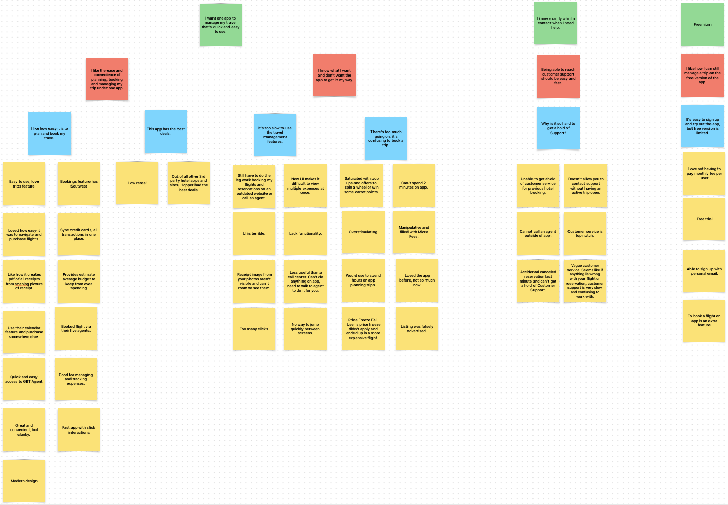
The three companies I used for user research, in addition to Hopper, were TravelBank, Amex GBT Mobile, and SAP Concur.
I took note of reviews left by users on their respective apps and produced an affinity map to identify key design themes.
The consensus between all the apps spoke to how “clunky” and inefficient it is to perform essential tasks. Others Users expressed frustration when making changes or exploring other options from existing reservations. Hopper specifically, Users found it difficult to get a hold of Customer Support, especially post-trip. Users were informed to contact them through the app, Facebook Messenger, or DM them on Twitter. A survey was created and the majority of participants mentioned their company doesn’t have a business travel app that they partnered with. Most participants have to plan, book and submit travel reports on their own.
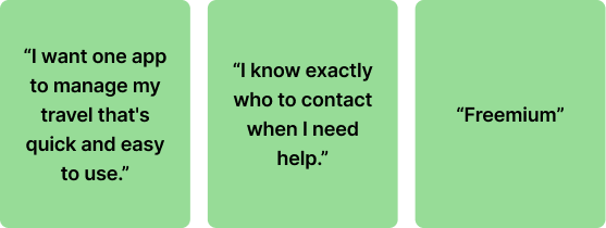
The 3 Design Themes for this product are..
Early Iterations
From initial brainstorming, it was decided to focus on User Flows that aligned with the Key Design Themes and the customer goals that they would frequent the most.
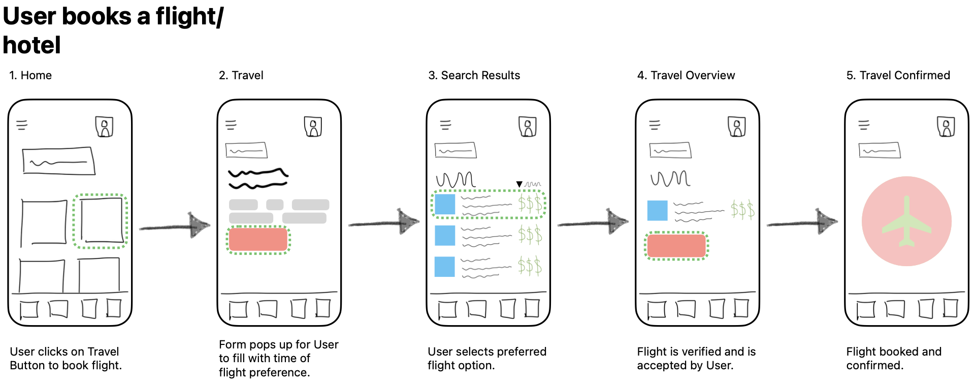
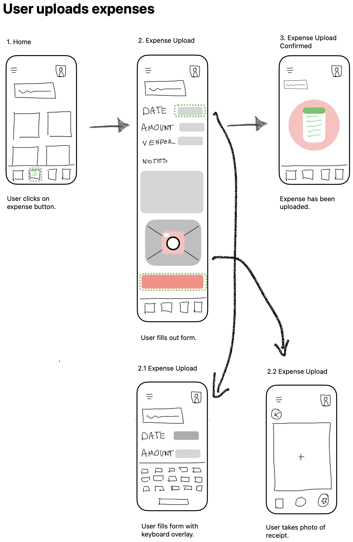
Make flight reservations.
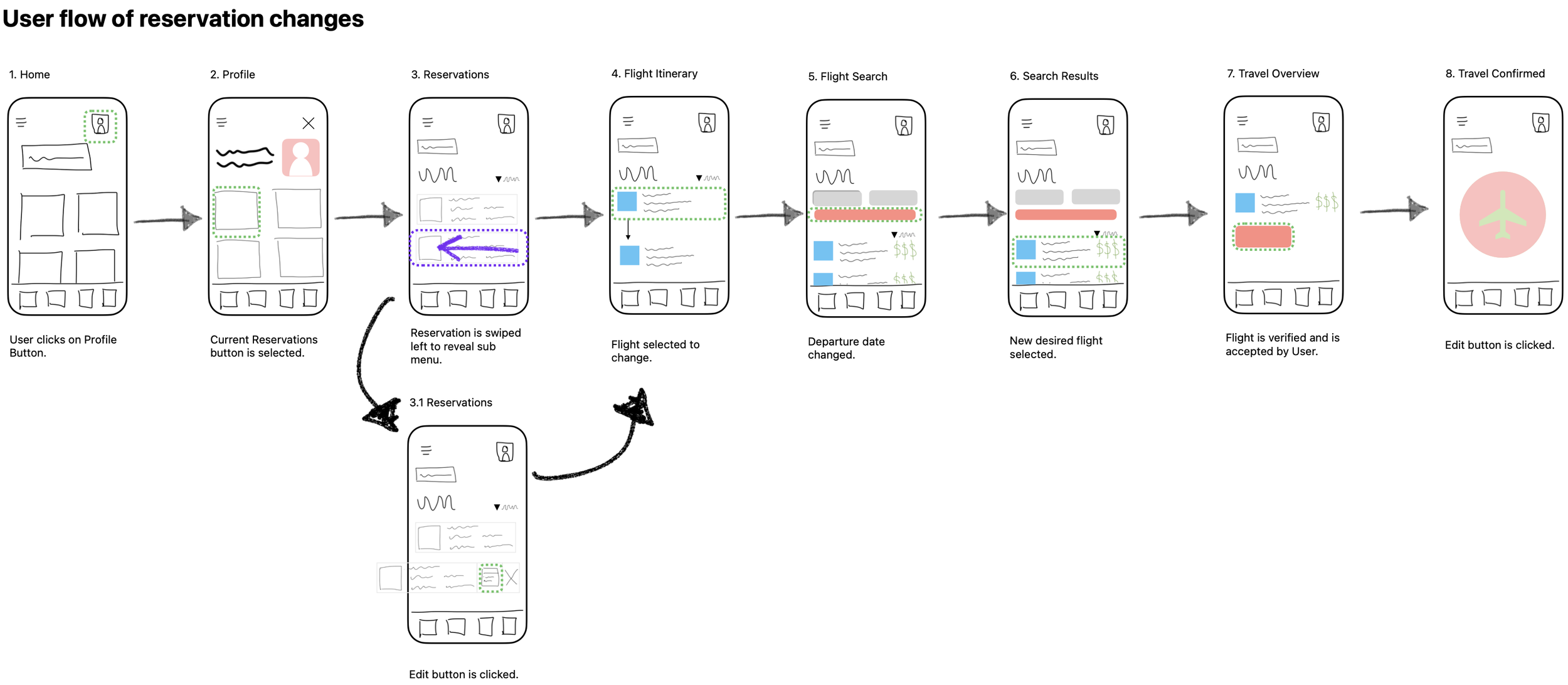
Updating current reservations.
Uploading business expenses.
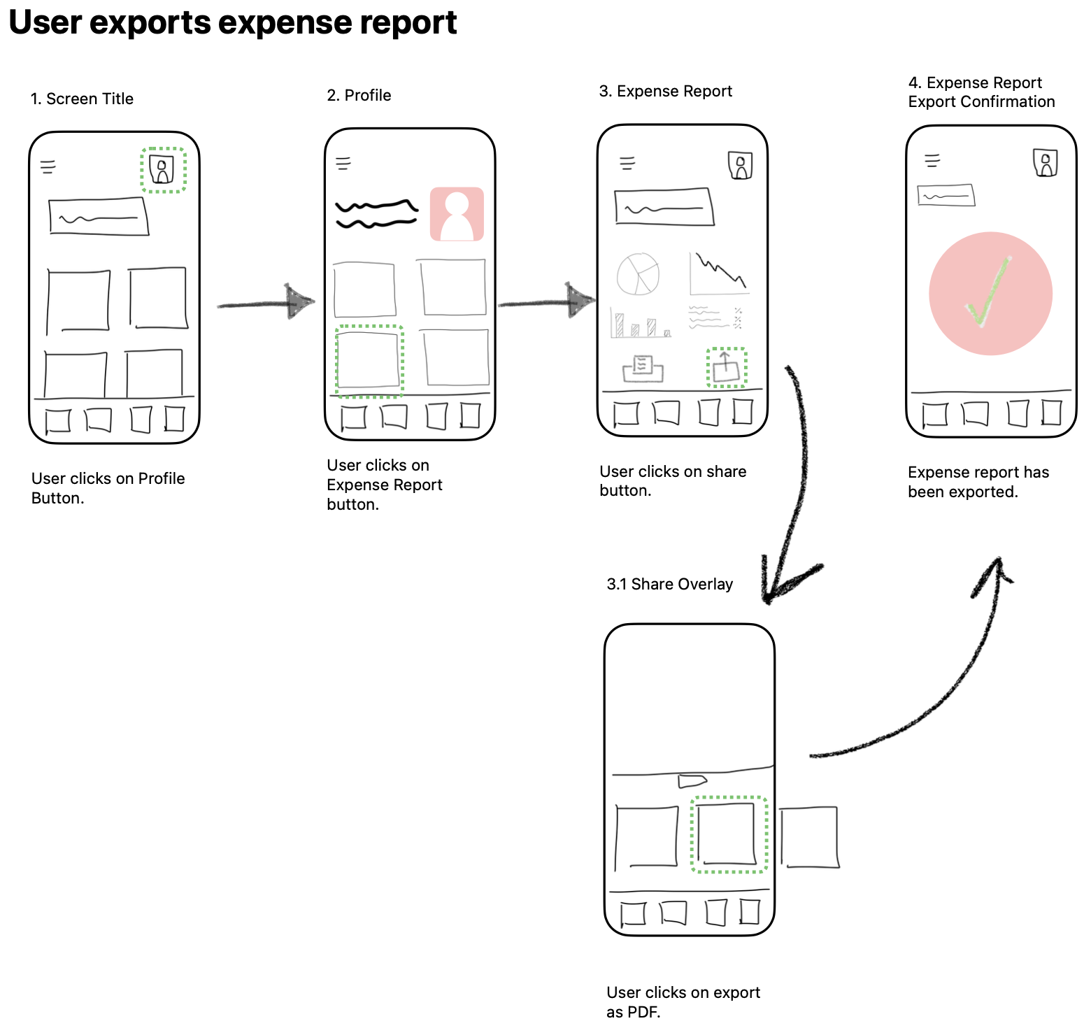
Exporting expense reports.
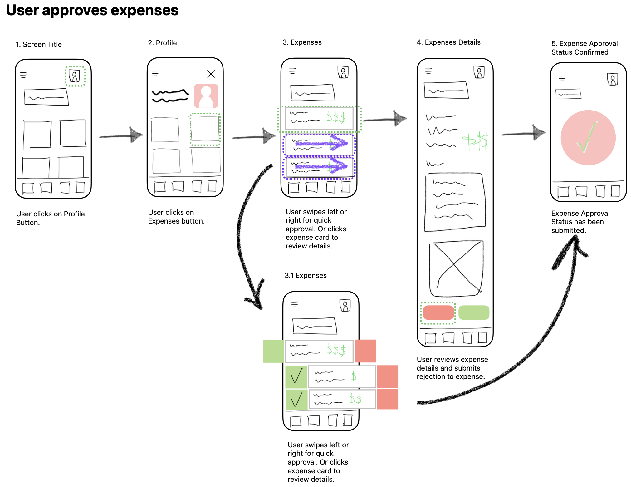
Approving expenses, which would be a Premium feature that can also be done for reports.
The main focus for this project was the usability of the app itself, not showcasing how Hopper’s fintech would be integrated into a corporate travel app. Hopper Cloud has clearly proven how capable their fintech can seamlessly integrate into different applications. For simplicity, I chose not to build out Hopper’s features such as Price Freeze or Price Predictions.
Creating Wireframes
One of the main themes I kept referring to when designing the product was, Quick and Easy. I wanted the User to get to where they wanted to go when they wanted to, getting the app out of their way to reach their goal.
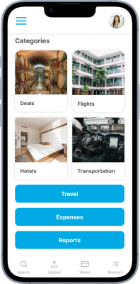
Home Screen Example
I took into account the thumb zones when laying out the different buttons, locating the most frequent features towards the bottom of the screen.

From Left to Right: Home Screen, Thumb Zones ranging from green towards the bottom of screen to yellow towards the top of scree, Home Screen with Thumb Zone overlay.
Initially, I sketched most features accessible through the User’s Profile. After building out the wireframes, I noticed the redundant actions taken to access multiple features. To address this, I grouped the different features based on the speed of access, where the navigation houses the fastest needed features such as Search, Expense Upload, Wallet, and Itinerary. The further away from the navigation bar, the least time-sensitive the features are.
This concept was applied to different screens throughout the product when possible.
Insights
The initial sitemap was laid out mimicking a traditional OTA for leisure travelers, prioritizing Users to book using the app. When creating User Flows, the product started to become “clunky” when core features are accessible on the 3rd Navigation level.

To solve the inefficiency of the product, I thought about the user environment when using the app. Users are either planning their trip or in the middle of their trip. This creates two environments, Non-urgent, and Urgent Use. Taking these two environments into account, I prioritized the core features that Users need by urgency. The final hierarchy was modified to have core features accessible from the Secondary Navigation.

Individual screens followed this same hierarchy when possible. Urgent Use features are found closer to the bottom of the screen, whereas Non-urgent features can be found on the upper portion of the screen.
Next Steps
Because this product is only a mid-fidelity prototype, there’s a lot more to do. Usability testing would be the next step to determine if the Content Hierarchy is effective in reducing time in achieving their goals. A/B Testing can be conducted as well.
Additional User Research will be performed to ensure that Key Design Themes are met or if others should be considered.
Once we're confident with achieving the main goals, detailed aspects would be ironed out such as spacing, motion and microinteractions. From there, a design system will be created in preparation for the handoff to developer.
What I Learned
The quality of the work done at the beginning of the design process really does matter. Even though I used affinity mapping and market research to get a general sense of what direction to go in, more data was needed.
I created a survey and reached out to some of my friends who I knew traveled for business and asked if they could volunteer their time. After looking at the results, I realized the sample size was too small with the majority of my questions not specific enough to gather the data I need to determine my design choices. This also made it difficult for me to produce a reliable User Persona. I had to rely heavily on what other competitors were doing and the User Reviews online.

Overall, this project was a huge learning experience. The challenging part of this whole processes was writing up the case study, explaining what decisions I made and why. Having to design and stop frequently to learn about different methods or tool techniques, and learning how to sum it up in a case study made the timeline of this project longer than expected.
Prototype
Try performing some of the core User Flows yourself.